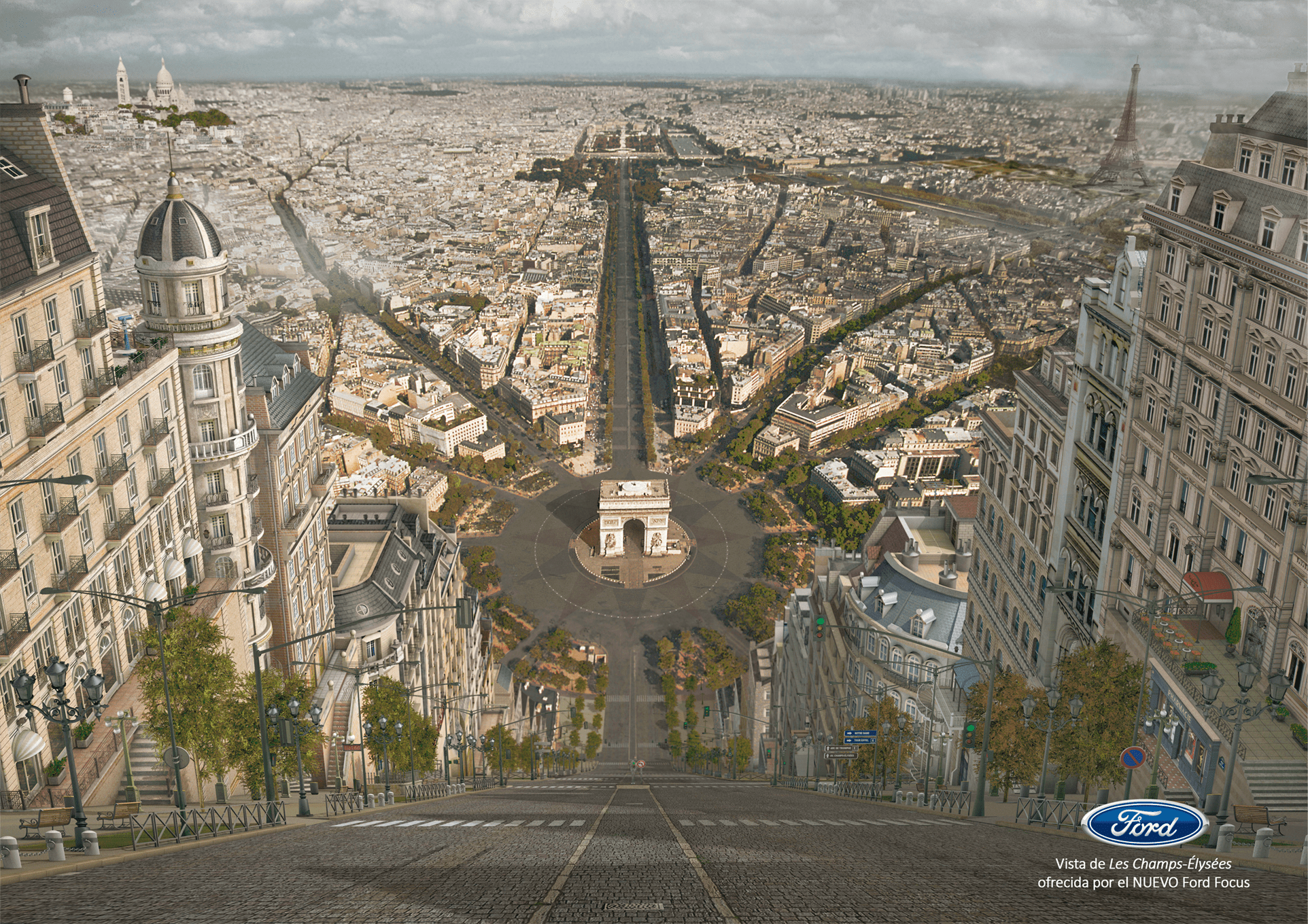
This is the making of a winner piece!. It was made by XÁTIVA in collaboration with the international publicity agency Bassat Ogilvy. It won the SOL the Plata Award at the Iberoamerican Advertising Festival of San Sebastián, being recognized as the second best advertisement for print. It was created to comunicate potencial clients about the new Ford Focus model release. Creatives Borja Bercial and Emilano González at Bassat Ogilvy wanted to produce a shoking image that could tell audiences that “moving through your city in a Ford Focus is such an extremely exciting experience it could make your enviroment transform as you drive”.
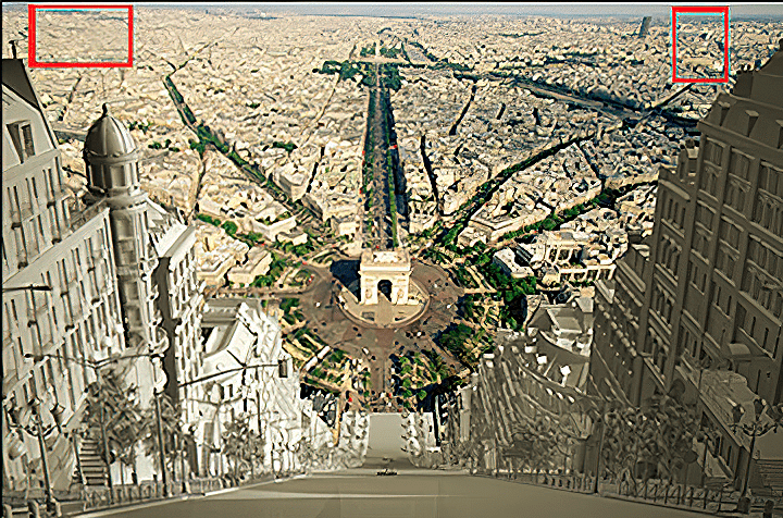
The final image, that was made by combining 3D graphics and photomontage techniques, presents a vision of Avenue de la Grande Armeé in Paris, which appears to be a dizzyingly inclined ramp, with views towards the Champs Élysées and focused on the Arc de Triomphe, inviting maximum success from on high. The enviroment that client was looking for this piece was a cloudy, autumnal and desaturated afternoon; clouds shadows are seen falling on the streets of Paris and in the background, some of the best-known monuments of the city.
To achive this concept, the idea was to take famous city streets of the world, and convert them into very inclinated ramps…(this is how you will see your city from the new Ford Focus!). The scene was created in 3D, being the ramp, its buildings and all street elements detailed 3D objects; The rest of the city would be created using a Paris image. “Mattes” are used when creating special effects and in general terms they are images or drawings placed far away in a second plane to create a landscape or enviroment; in many cases the elements that are close to the camera are 3D objects and the far away elements and landscapes are well treated and integrated images. This is exactly what was done in this advertisement.
The first thing task was presenting a preliminary hand sketch to the client to begin the visualization and to find the best possible high-res image of Paris. The selected base image was an aerial view (focusing on the Arch of Triumph) that needed some preliminary color adjustents and editing to achive an horizon tweaking.
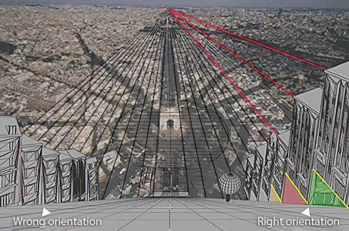
The basic 3D scene set up was just a 3D camera frontally looking at a 3D plane with the base aerial image proyected on it, and the 3D ramp which was inclinated 60 degrees. At that moment, it was needed to do some camera matching work to make these three basic elements stay well positioned in relation to the appropriate vanishing point. Some basic reference buildings were set over left and right sides of the ramp to calculate which would be the right number and proportion of the buildings that would be in our street (that in real life is called Avenue de la Grande Armeé). Two important things were discovered at this stage of the work:
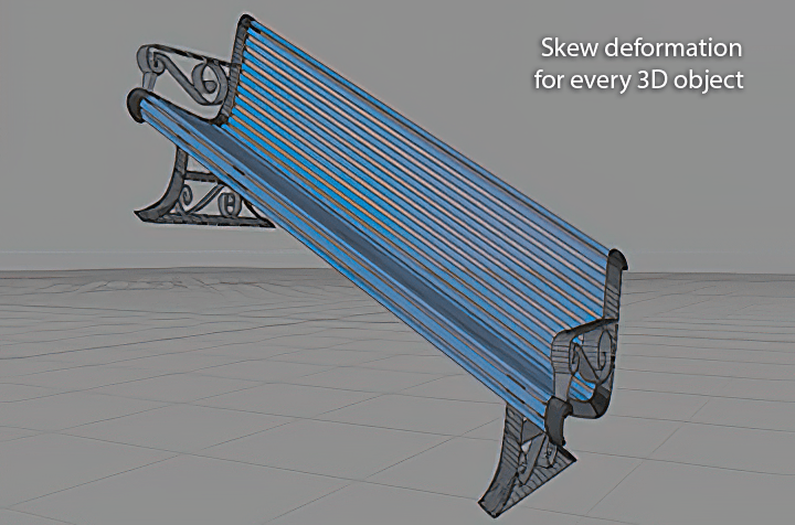
1. Every single element of street furniture in this peculiar street needed a skew deformation (60 degrees) to be adapted correctly to the scene! It is almost an optical effect that is there, difficult to know if nobody tells you. Every 3D object needed to be oriented in parallel to the buildings in the base picture, never to the surface normal of the ramp.
2. After a building was correctly oriented, there was a gap between it and the ramp, (see coloured triangled areas) so some very creative modeling of stairs and balconies was needed for each building to complete the lower part of models and addapt them to the ramp.
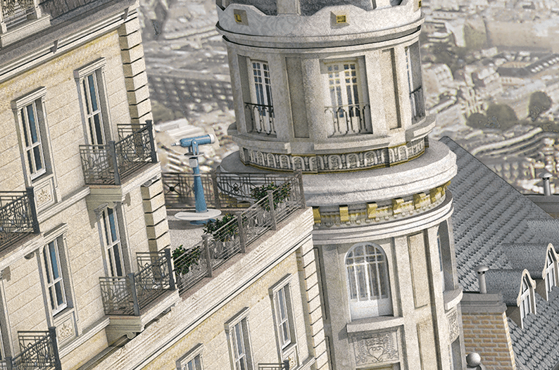
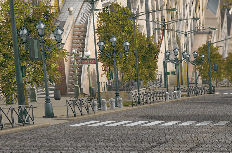
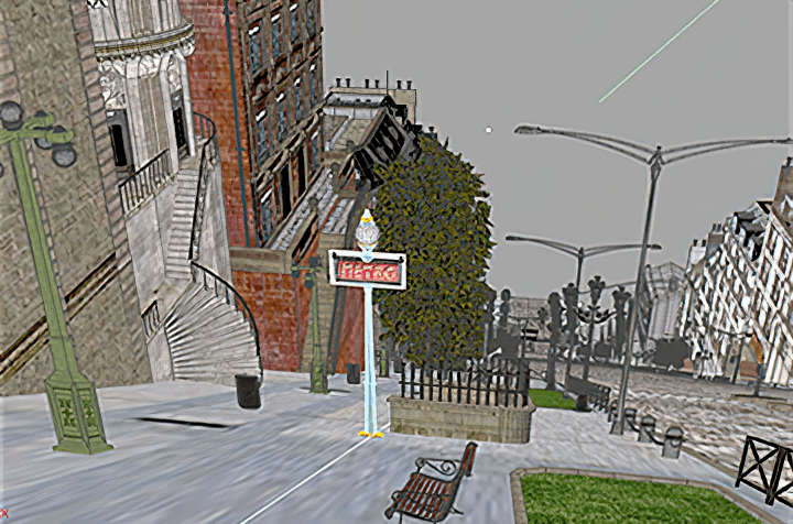
Obtaining, modeling and adapting all the 3D models of elements that could be found in a Parisian street was a very laborious job. The level of detail in 3D objects was high (specilly on those close to the camera) because we wanted a quite realistic final image. It was important to make sure that were only modelled the parts of the buildings that could be seen from the static 3D camera to avoid doing unnecessary work. A study of parisian style arquitecture was done to reproduce roofs, balconies and windows as they are suposed to be. Many reference images were studied. A huge recopilation of images that could be used as textures was done: trafic signs, bricks, tiles, concrete, stone…etc. When the modeling phase was concluded, some preliminary 3D lightning and render configuration tests were done. It was necessary to prepare the scene for the texturing phase. Next samples show some views during 3D models texturing:
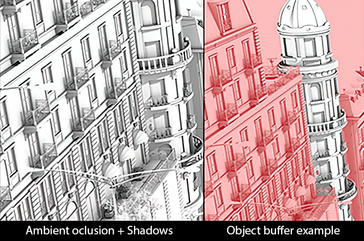
The main texture for most of the buildings had a planar proyection. A cubic proyection was applied to all the building details that stuck out of the facades. Some particular textures were specially designed, as the one used for the cobblestone road which is seamless and was edited to add some witty details as tire marks. When texturing was finished, the 3D lightning set up was improved trying to accomplish the mood that creatives at Bassat Ogilvy wanted; They asked for an autumnal looking unsaturated image, so the 3D lightning had to be adjusted at that moment with that idea in mind. The render configuration was set up with special interest in creating many object buffer masks for most of the 3D objects in the scene, to obtain the best possible control during postproduction and get the chance to adjust the look of different parts of the image independently. The final multipass render had the following separated channels: shadows, ambient oclusion, global illumination, reflections and bump.
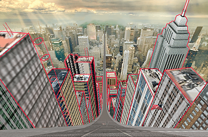
Post-production was one of the most important phases in which many adjustments were made to the final image: All the cars and people that appeared in the image were removed, some important monuments such as the Eiffel Tower (with a 3D object) or Montmartre (by photographic composition) were forced to appear in the image to make the location even more recognizable, depth of field effect was applied to blur up far away elements in the background, clouds were included around some of the closest buildings to enhance the feeling of altitude… The piece contains a high level of detail to enhance its realism. It is a curious advertisement due to the absence of the product, only the phrase “View of Les Champs Elysées offered by the new Ford Focus” and the logo of the brand were added. A sketch of the same concept applied to New York City was requested.